1. Matplotlib 개요
1-1. Matplotlib란?
Matplotlib는 파이썬에서 플롯(그래프)을 그릴 때 주로 쓰이는 2D, 3D 플롯팅 패키지(모듈)입니다. 이 패키지는 저명한 파이썬 라이브러리 개발자인 John Hunter에 의해 개발되었습니다. 2003년 version 0.1이 발표된 이후 현재까지 꾸준히 발전해온 약 20년의 역사를 가진 패키지입니다. 산업과 교육계에서 널리 쓰이는 수치해석 소프트웨어인 MATLAB과 유사한 사용자 인터페이스를 가지고 있어 각 업계에서 쉽게 접근 가능합니다.
1-2. Matplotlib의 장점
- 운영 체제에 구애받지 않음: 다양한 운영 체제에서 동작합니다.
- 세부 서식 설정 가능: 다양한 그래프와 그 구성 요소에 대해 상세한 서식을 설정할 수 있습니다.
- 다양한 출력 형식 지원: PNG, SVG, JPG 등 여러 출력 형식을 지원합니다.
- MATLAB과 유사한 인터페이스: MATLAB과 비슷한 사용자 인터페이스를 제공하여 MATLAB 사용자들이 쉽게 접근할 수 있습니다.
1-3. 데이터 시각화
데이터 시각화는 정보를 그래프로 나타내는 과정입니다. 차트, 그래프, 맵과 같은 시각적 요소를 사용하여 데이터를 시각적으로 표현함으로써 데이터에서 추세, 이상 값 및 패턴을 보고 이해할 수 있게 해줍니다. 데이터 시각화는 데이터 분석에 쉽게 접근할 수 있도록 하는 방법으로, 특히 빅 데이터의 세계에서 막대한 양의 정보를 분석하고 데이터 기반 의사 결정을 내리는 데 필수적입니다.
1-4. 데이터 시각화의 필요성
- 시각적 정보의 중요성: 인간은 시력을 통해 얻는 정보량이 다른 감각 기관을 통해 얻는 정보량보다 훨씬 많습니다.
- 데이터 관리와 이해의 어려움: 지나치게 많은 데이터로 인해 이를 관리하고 이해하는 어려움이 계속해서 증가하고 있습니다.
- 통계 데이터의 인지적 어려움: 대부분의 사람들은 통계 데이터에 대해 잘 알지 못하며, 기본적인 통계 방법(평균, 중위수, 범위 등)은 인간의 인지적 특성과 맞지 않습니다.
- 규칙의 명확한 인지: 통계 방법에 따라 규칙을 보는 것은 어렵지만, 데이터가 시각화되면 규칙은 매우 명확히 인지할 수 있습니다. 예를 들어, 안스콤비의 4중주(Anscombe's Quartet)와 같은 사례에서 데이터 시각화는 데이터의 특성을 명확히 파악하는 데 큰 도움을 줍니다.
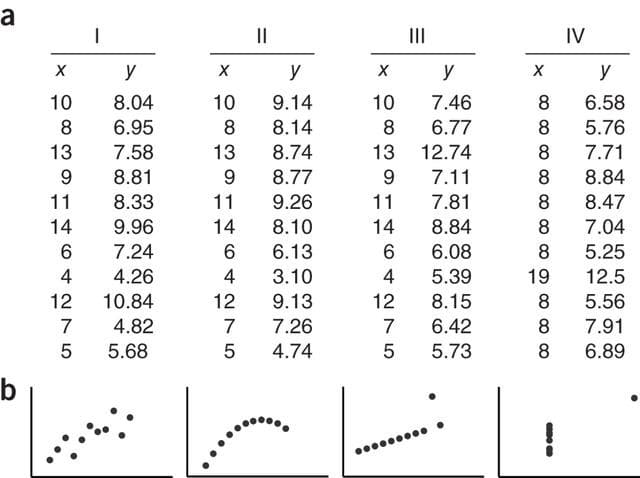
a를 보면 어떤 데이터를 의미하는지 한 눈에 알아보기 어려운데
b처럼 데이터 시각화를 통하면 데이터가 어떤식으로 구성되어있는지를 파악하기 쉽다.
2. 환경설정
/usr/local/lib/python3.10/dist-packages/IPython/core/pylabtools.py:151: UserWarning: Glyph 50724 (\N{HANGUL SYLLABLE O}) missing from current font. fig.canvas.print_figure(bytes_io, **kw) /usr/local/lib/python3.10/dist-packages/IPython/core/pylabtools.py:151: UserWarning: Glyph 45720 (\N{HANGUL SYLLABLE NEUL}) missing from current font. fig.canvas.print_figure(bytes_io, **kw) /usr/local/lib/python3.10/dist-packages/IPython/core/pylabtools.py:151: UserWarning: Glyph 46020 (\N{HANGUL SYLLABLE DO}) missing from current font. fig.canvas.print_figure(bytes_io, **kw) /usr/local/lib/python3.10/dist-packages/IPython/core/pylabtools.py:151: UserWarning: Glyph 51600 (\N{HANGUL SYLLABLE JEUL}) missing from current font. fig.canvas.print_figure(bytes_io, **kw) /usr/local/lib/python3.10/dist-packages/IPython/core/pylabtools.py:151: UserWarning: Glyph 44144 (\N{HANGUL SYLLABLE GEO}) missing from current font. fig.canvas.print_figure(bytes_io, **kw) /usr/local/lib/python3.10/dist-packages/IPython/core/pylabtools.py:151: UserWarning: Glyph 50868 (\N{HANGUL SYLLABLE UN}) missing from current font. fig.canvas.print_figure(bytes_io, **kw) /usr/local/lib/python3.10/dist-packages/IPython/core/pylabtools.py:151: UserWarning: Glyph 54616 (\N{HANGUL SYLLABLE HA}) missing from current font. fig.canvas.print_figure(bytes_io, **kw) /usr/local/lib/python3.10/dist-packages/IPython/core/pylabtools.py:151: UserWarning: Glyph 47336 (\N{HANGUL SYLLABLE RU}) missing from current font. fig.canvas.print_figure(bytes_io, **kw)

- 쓸데없는 경고가 많이 나오는 문제 해결하기 위해 import warnings 이용
- 한글이 깨지는 문제
- 이유: 한글 폰트가 설치되어 있지 않기 때문
['sans-serif']
- 갑자기 음수 부호(-)가 표시되지 않음
- 한글폰트와 유니코드의 음수 부호가 충돌을 일으키기 때문임
- 그래프를 그릴때 별도의 창이 열리고 그 위에서 그려지는 문제
- Colab을 이용하는 경우
- Colab은 기본적으로 현재 창에서 그래프가 그려지므로 따로 조치할 필요가 없음
- 개인 환경에서 Jupyter Notebook/Lab을 이용하는 경우
- %matplotlib inline 명령어를 통해서 해결 가능
%matplotlib inline
- %matplotlib inline 명령어를 통해서 해결 가능
- Colab을 이용하는 경우
3. 그래프의 기본 구성
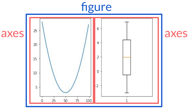
figure : 그래프를 그리는 전체 큰 영역
axes : 그림을 그린 그래프 1개의 영역
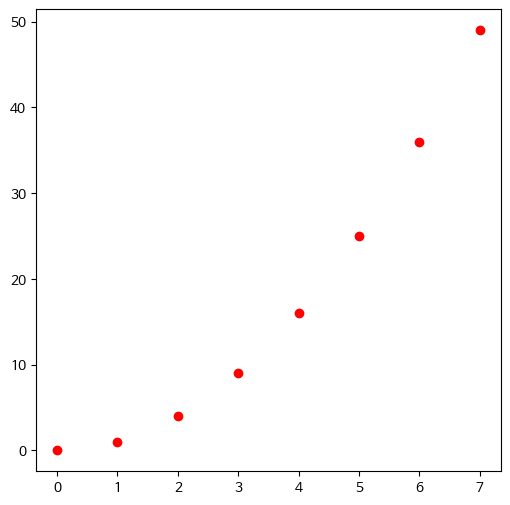
4. 기본 그래프 그리기
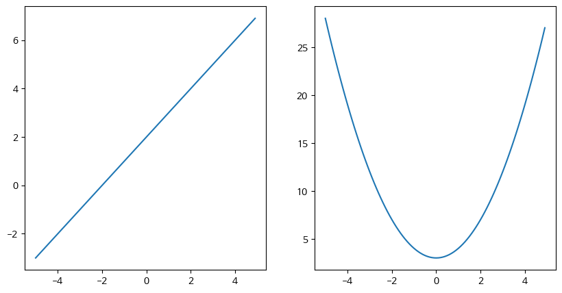
4-1. Figure
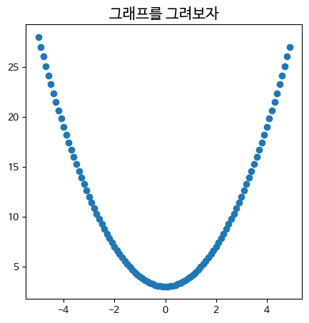
수식 표현
- −5<x<5 , (x의 간격은 0.1)
- y1=x2+3
array([-5.00000000e+00, -4.90000000e+00, -4.80000000e+00, -4.70000000e+00,
-4.60000000e+00, -4.50000000e+00, -4.40000000e+00, -4.30000000e+00,
-4.20000000e+00, -4.10000000e+00, -4.00000000e+00, -3.90000000e+00,
-3.80000000e+00, -3.70000000e+00, -3.60000000e+00, -3.50000000e+00,
-3.40000000e+00, -3.30000000e+00, -3.20000000e+00, -3.10000000e+00,
-3.00000000e+00, -2.90000000e+00, -2.80000000e+00, -2.70000000e+00,
-2.60000000e+00, -2.50000000e+00, -2.40000000e+00, -2.30000000e+00,
-2.20000000e+00, -2.10000000e+00, -2.00000000e+00, -1.90000000e+00,
-1.80000000e+00, -1.70000000e+00, -1.60000000e+00, -1.50000000e+00,
-1.40000000e+00, -1.30000000e+00, -1.20000000e+00, -1.10000000e+00,
-1.00000000e+00, -9.00000000e-01, -8.00000000e-01, -7.00000000e-01,
-6.00000000e-01, -5.00000000e-01, -4.00000000e-01, -3.00000000e-01,
-2.00000000e-01, -1.00000000e-01, -1.77635684e-14, 1.00000000e-01,
2.00000000e-01, 3.00000000e-01, 4.00000000e-01, 5.00000000e-01,
6.00000000e-01, 7.00000000e-01, 8.00000000e-01, 9.00000000e-01,
1.00000000e+00, 1.10000000e+00, 1.20000000e+00, 1.30000000e+00,
1.40000000e+00, 1.50000000e+00, 1.60000000e+00, 1.70000000e+00,
1.80000000e+00, 1.90000000e+00, 2.00000000e+00, 2.10000000e+00,
2.20000000e+00, 2.30000000e+00, 2.40000000e+00, 2.50000000e+00,
2.60000000e+00, 2.70000000e+00, 2.80000000e+00, 2.90000000e+00,
3.00000000e+00, 3.10000000e+00, 3.20000000e+00, 3.30000000e+00,
3.40000000e+00, 3.50000000e+00, 3.60000000e+00, 3.70000000e+00,
3.80000000e+00, 3.90000000e+00, 4.00000000e+00, 4.10000000e+00,
4.20000000e+00, 4.30000000e+00, 4.40000000e+00, 4.50000000e+00,
4.60000000e+00, 4.70000000e+00, 4.80000000e+00, 4.90000000e+00])
array([28. , 27.01, 26.04, 25.09, 24.16, 23.25, 22.36, 21.49, 20.64,
19.81, 19. , 18.21, 17.44, 16.69, 15.96, 15.25, 14.56, 13.89,
13.24, 12.61, 12. , 11.41, 10.84, 10.29, 9.76, 9.25, 8.76,
8.29, 7.84, 7.41, 7. , 6.61, 6.24, 5.89, 5.56, 5.25,
4.96, 4.69, 4.44, 4.21, 4. , 3.81, 3.64, 3.49, 3.36,
3.25, 3.16, 3.09, 3.04, 3.01, 3. , 3.01, 3.04, 3.09,
3.16, 3.25, 3.36, 3.49, 3.64, 3.81, 4. , 4.21, 4.44,
4.69, 4.96, 5.25, 5.56, 5.89, 6.24, 6.61, 7. , 7.41,
7.84, 8.29, 8.76, 9.25, 9.76, 10.29, 10.84, 11.41, 12. ,
12.61, 13.24, 13.89, 14.56, 15.25, 15.96, 16.69, 17.44, 18.21,
19. , 19.81, 20.64, 21.49, 22.36, 23.25, 24.16, 25.09, 26.04,
27.01])
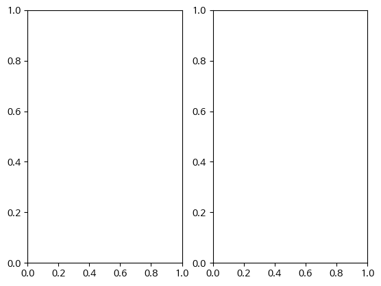
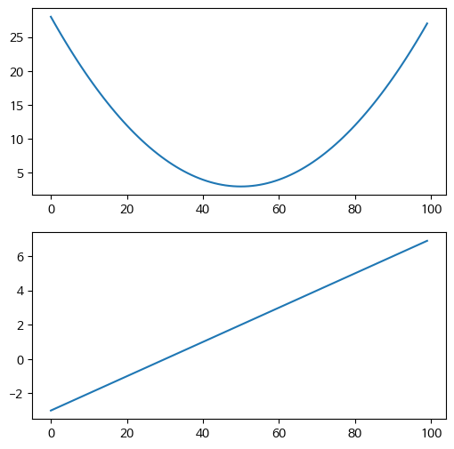
4-2. 그래프 여러 개 그리기
1. Figure 객체와 axes를 직접 생성 후 생성된 axes에 대한 plot 멤버를 직접 호출하는 방법
2. pyplot.subplots 으로 Figure와 axes를 생성하는 방법
3. Figure 객체 생성 후, axes 추가하는 방법
- −5<x<5 , (x의 간격은 0.1)
- y1=x2+3
- y2=x+2
array([-3.0000000e+00, -2.9000000e+00, -2.8000000e+00, -2.7000000e+00,
-2.6000000e+00, -2.5000000e+00, -2.4000000e+00, -2.3000000e+00,
-2.2000000e+00, -2.1000000e+00, -2.0000000e+00, -1.9000000e+00,
-1.8000000e+00, -1.7000000e+00, -1.6000000e+00, -1.5000000e+00,
-1.4000000e+00, -1.3000000e+00, -1.2000000e+00, -1.1000000e+00,
-1.0000000e+00, -9.0000000e-01, -8.0000000e-01, -7.0000000e-01,
-6.0000000e-01, -5.0000000e-01, -4.0000000e-01, -3.0000000e-01,
-2.0000000e-01, -1.0000000e-01, -1.0658141e-14, 1.0000000e-01,
2.0000000e-01, 3.0000000e-01, 4.0000000e-01, 5.0000000e-01,
6.0000000e-01, 7.0000000e-01, 8.0000000e-01, 9.0000000e-01,
1.0000000e+00, 1.1000000e+00, 1.2000000e+00, 1.3000000e+00,
1.4000000e+00, 1.5000000e+00, 1.6000000e+00, 1.7000000e+00,
1.8000000e+00, 1.9000000e+00, 2.0000000e+00, 2.1000000e+00,
2.2000000e+00, 2.3000000e+00, 2.4000000e+00, 2.5000000e+00,
2.6000000e+00, 2.7000000e+00, 2.8000000e+00, 2.9000000e+00,
3.0000000e+00, 3.1000000e+00, 3.2000000e+00, 3.3000000e+00,
3.4000000e+00, 3.5000000e+00, 3.6000000e+00, 3.7000000e+00,
3.8000000e+00, 3.9000000e+00, 4.0000000e+00, 4.1000000e+00,
4.2000000e+00, 4.3000000e+00, 4.4000000e+00, 4.5000000e+00,
4.6000000e+00, 4.7000000e+00, 4.8000000e+00, 4.9000000e+00,
5.0000000e+00, 5.1000000e+00, 5.2000000e+00, 5.3000000e+00,
5.4000000e+00, 5.5000000e+00, 5.6000000e+00, 5.7000000e+00,
5.8000000e+00, 5.9000000e+00, 6.0000000e+00, 6.1000000e+00,
6.2000000e+00, 6.3000000e+00, 6.4000000e+00, 6.5000000e+00,
6.6000000e+00, 6.7000000e+00, 6.8000000e+00, 6.9000000e+00])
2번 방법 이용 그림 그리기
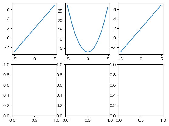


앞에 크기잡는것은 동일하지만, 앞에서는 서브플롯 크기를 지정했다면 이번에는 값을 집적 넣어주는 형식
- 세로로 화면을 분할하여 그래프를 그려보기
- x값이 없어서 기존 y값 100개까지만 그려짐
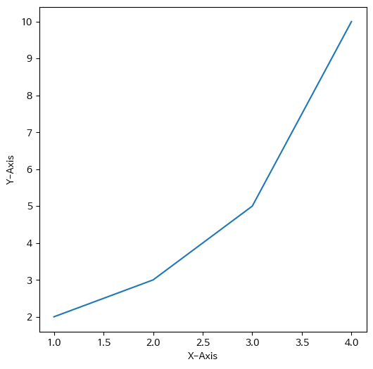
- 그래프에 가로선 그어보기
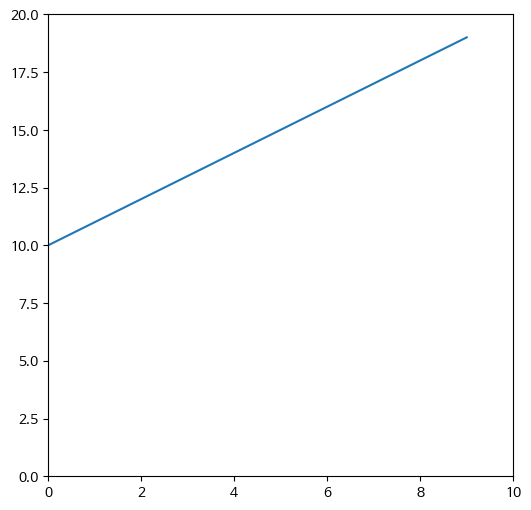
- x = range(0, 10)
- y1=v2 (→ y1 = [v*v for v in x] )
- y2=log(v) (→ y2 = [np.log(v) for v in x] )

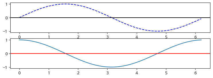
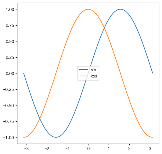
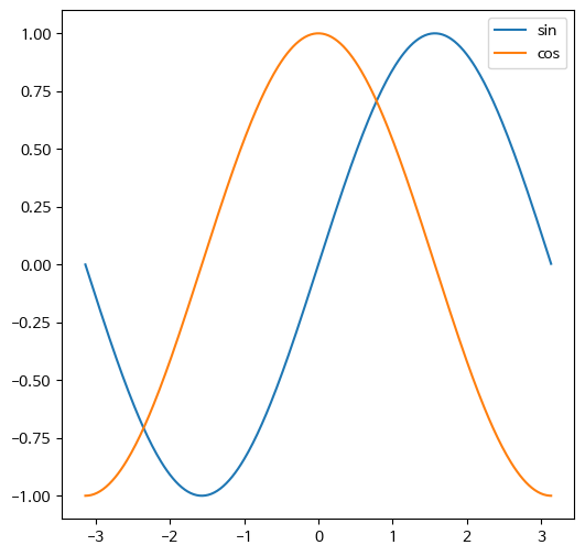
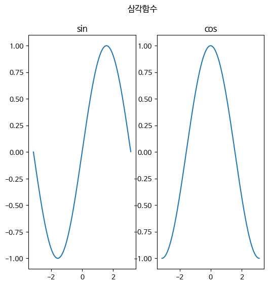
- 2행 1열의 axes에 sin(x) 그래프와 cos(x) 그래프 그려보기
- x축을 표시하시오
- x의 범위는 0부터 2*pi까지, 0.1 간격으로
- sin_y=np.sin(x)
- cos_y=np.cos(x)
3-3. Axis

3.3.1 xlim, ylim

나중에는 plt를 바로 쓰는것 보다 axis 조절해서 하는것이 더 좋을 경우가 많다.
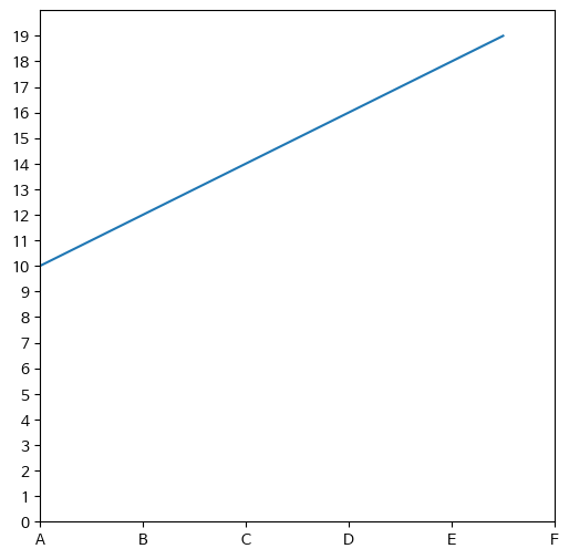
3.3.2 ticks
- 지정해주는데로 넣어줄 수 있다.
3-4. Legend

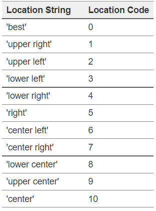
- 범례(Legend) 위치 표시 코드
3-5. Text
3.5.1 fig와 axes의 title
3.5.2 x, y label

라벨 위치 바꾸기
3.5.3 text

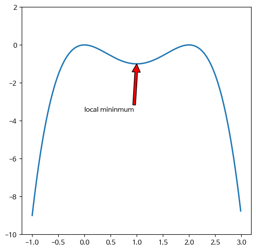
3.5.4 annotate
특정점을 찾아서 알려주는것(화살표)
'PYTHON-BACK' 카테고리의 다른 글
| #파이썬 기초 12일차 (3) | 2024.07.16 |
|---|---|
| #파이썬 기초 11일차 (0) | 2024.07.11 |
| #파이썬 기초 10일차_1 (0) | 2024.07.10 |
| #파이썬 기초 9일차_2 (0) | 2024.07.09 |
| #파이썬 기초 9일차_1 (0) | 2024.07.09 |


